Imprenta Reyes
- Corporate identity and applications redesign
- Imprenta Reyes | Printing Solutions
- 2023
A project focused on redefining the essence of a long-established printing house. This new identity, faithful to its symbol yet featuring a renewed visual concept, evokes precision and energy through an audacious composition of typography and colour.

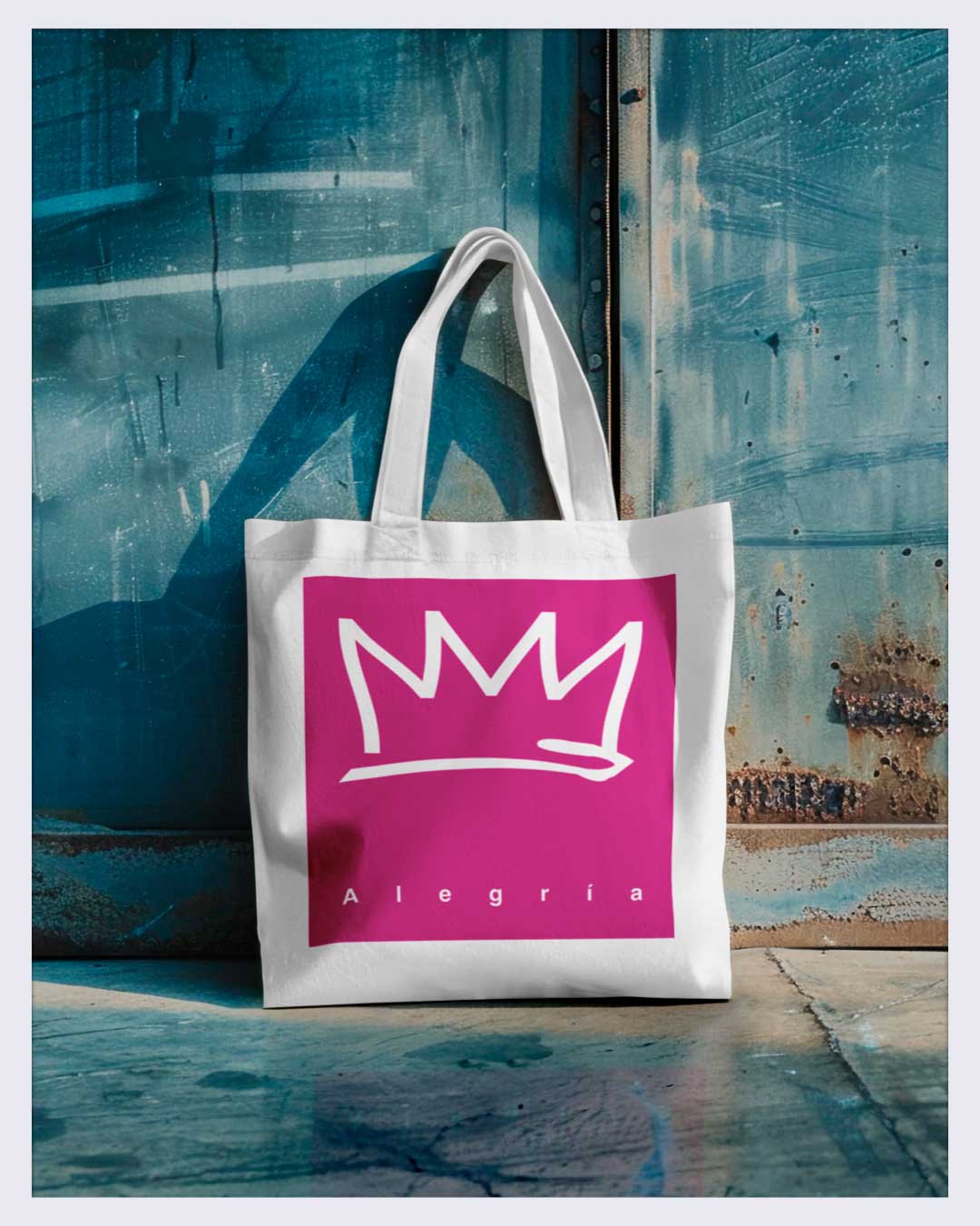
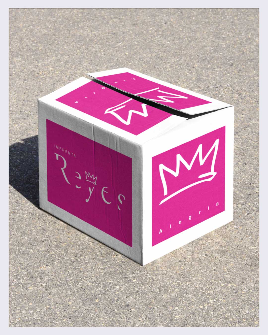
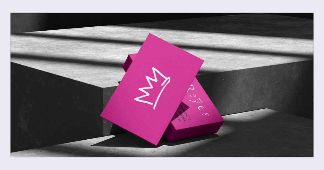
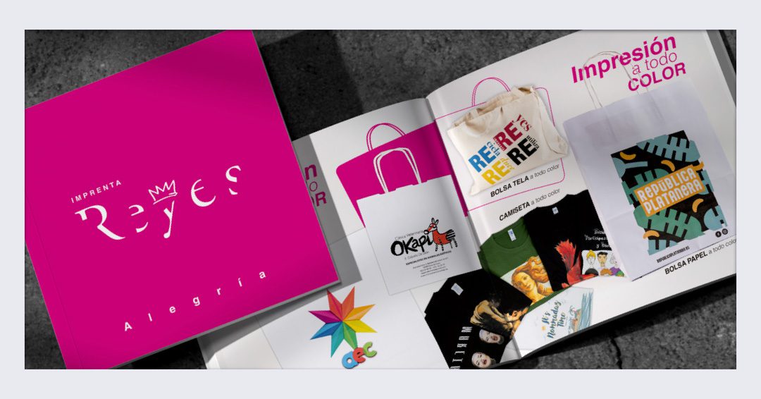
Imprenta Reyes
Joy
Imprenta Reyes
Joy

Project details:
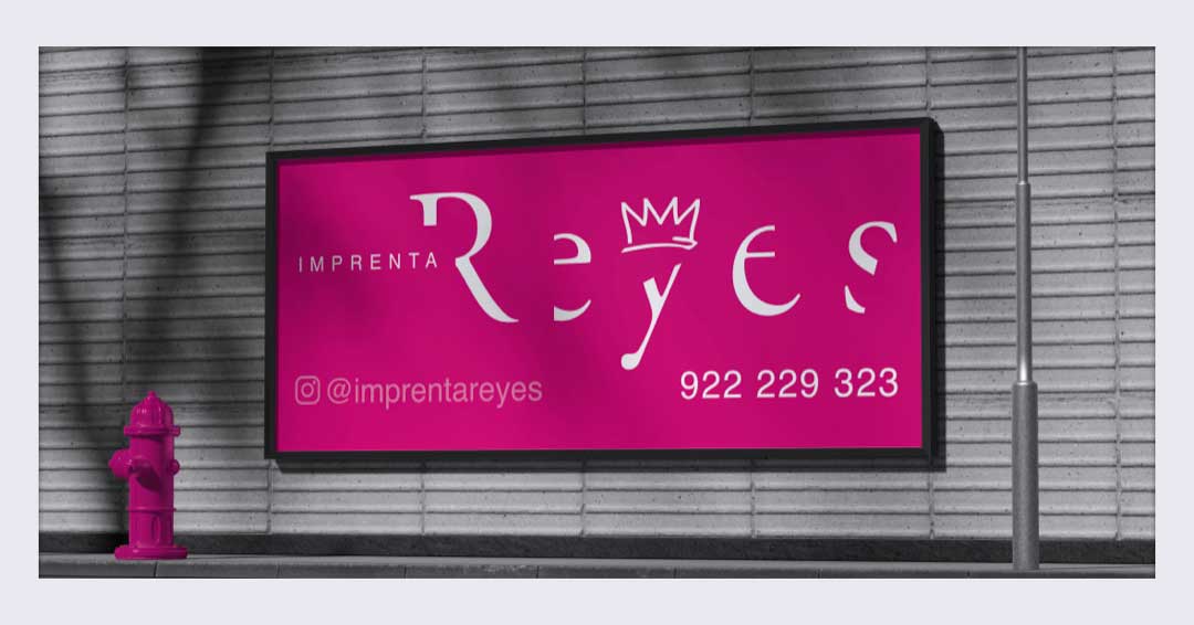
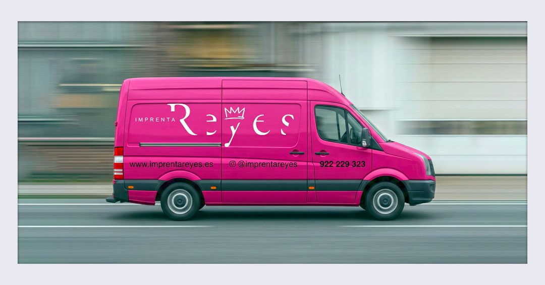
Choosing magenta as the primary colour was a clear statement of intent: a tribute to the heart of process printing, conveying both aesthetic energy and the constant action of a company that lives by the frenetic rhythm of the machinery and the printing craft. The typographic play completed the concept: the distinctive slant of the lettering evokes skill, precision, and technical mastery.
By the way, the balance between innovation and craft was the true driving force behind the change; the goal was for the identity to retain its family essence, allowing it to coexist with the avant-garde, sustainable character that leads Imprenta Reyes towards excellence in printing. “Adapt or perish”, in a sector so challenged by the digital age, is the motto that has guided the modernisation of this brand.